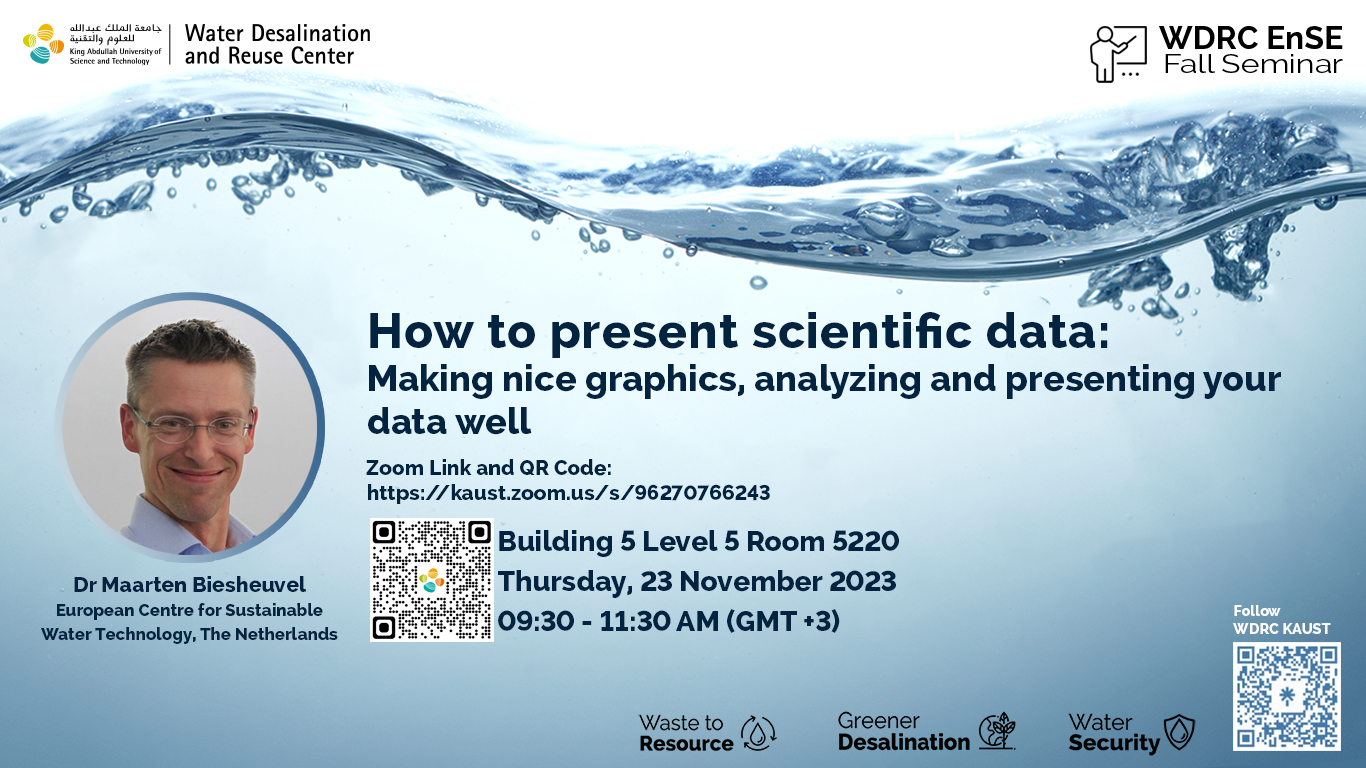


Making nice graphics and analyzing and presenting your data well. It can never be stressed enough that the figures (graphics) in your report or scientific paper are the first thing that everyone looks at. They must be of very good visual quality, presenting your data in a clear and insightful manner. This will help your readers to appreciate your report or paper more and give it more attention and thus it will have more impact. Of special importance is the topic of “error bars” and everything related to that. In the presentation we illustrate how you help yourself if you try to avoid error bars, but instead simply present all data. Also your life in the lab can be more pleasant if you follow some simple advises related to how you will later on present your data.
Before the break we look at making nice and elegant graphics that help to make your data are presented in the best way without fancy statistics. After the break we go into some specific examples of what is sometimes hidden behind error bars and ‘box and whisker’-plots. We also discuss how to present values in tables.
Dr. Maarten Biesheuvel is principal scientist at Wetsus, European Centre for Sustainable Water Technology, The Netherlands. He is the author of two textbooks on electrochemical processes and 160 scientific publications in the field of the theory of transport processes and physical chemistry, including theory for capacitive deionization, electrodialysis, and reverse osmosis. He is in editorial board member of the journals Desalination and J. Membrane Science Letters. He is regularly invited to give tutorial lectures on transport theory and chemical equilibrium, specifically on reverse osmosis and electrodialysis, as well as on the history of theory for activity coefficients of ions. Other highly acclaimed tutorial lectures provide students (BSc to PhD level) with useful insights in data analysis and graphical presentations of data.